Swipe to unlock – Where UX/UI is heading
First is not always the best.
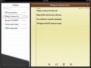
The way that we interact with our devices has changed over a very short period of time. Rather than pushing physical buttons and turning clunky dials, most of our interactions with our devices comes down to a series of taps and swipes on a digital screen. By moving towards an input method that lacks any sort of tactile feedback, the need to provide a method of acknowledging the user’s input was necessary in order to bridge the gap between the physical and the digital. A common practice was to adopt a form of design called ‘skeumorphism’: replicating a real world object or idea in a digital form. This means adding spiral binding and yellow paper to a notebook application, or giving the calendar a leather bound aesthetic.

This was done in order to ease the user of these earlier mediums into the adoption of this newer technology. This can be seen in the digital realm as far back as 1995 with the release of ‘Microsoft Bob’, an OS released by Microsoft with the intent of easing more people into the concept of their then vision of a “paperless office”. Although the inclusion of familiar environments was not enough to win over users, this was a precedent to the wide adoption and success of mobile operating systems. Before the popularity boom of the smart phone, mobile OS’ looked and felt like miniature versions of their full blown desktop counterparts. Due to technological limitations at the time, the main form of input came from precise taps. The inclusion of a stylus made this shift easier to manage.
While this method of input can be classified as the first instance that the general public has been introduced to touch screens, the technology was not without it’s limitations. The screen was unable to detect more than one interaction point at a time, the screen itself was cluttered with thin sensor squares obstructing the view, and scrolling felt janky and unresponsive. Through constant improvements and new innovations, the modern touch screen has blended the line between human touch and the digital content. Natural gestures and input methods were developed and implemented.
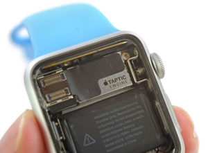
Now that this technology is widely accepted, it’s all about perfecting the art of interaction. By implementing technology like haptic feedback, users are greeted to a human like tap when interacting with their devices. By including this technology into wearables, users are able to receive notifications and confirmations without a distracting chime or alert buzz.

Another interesting trend in UX design comes from interacting with the real world through the use of AR. A variety of sensors are used to detect hand motion and movements.
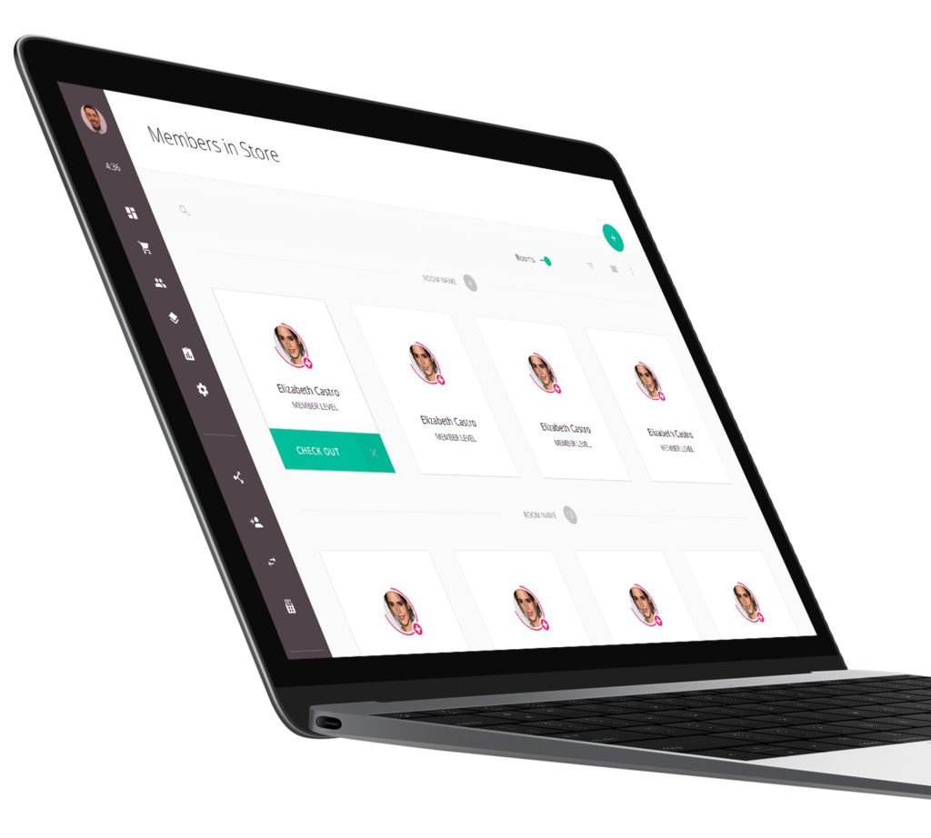
Many other trends have come up as the design of our smartphones have become more ubiquitous. Flat design puts emphasis on clean, sharp design which relies on eye catching and minimalistic design in order to delight the user.
Another recent trend in the Information Age is personalized design, which offers a chance for users to personalize their experience within a secure environment. This, along with many other methods, encourage existing customers and tend to guarantee their continued patronage.
Sources:
https://theblog.adobe.com/10-ux-design-predictions-for-2018/
https://www.rossul.com/2018/blog/top-ux-design-trends-in-2018/
2 comments on “Swipe to unlock – Where UX/UI is heading”
Comments are closed.


This was a really interesting history of the evolution of user-device interaction. Do you have any personal predictions for future trends or which types of interaction (e.g. voice interaction, AR) will dominate?
I’ve had conversations with school teachers in the past, and they actually predicted that students will move away from handwriting towards typing, and eventually things will shift from typing to voice-to-text. It’s interesting how quickly we ease into new types of device interaction.
As I was reading through this article it made me wonder why the haptics in my keyboard (and I’m sure everyone else’s) are lacking so much. The only thing I miss from playing games on my PC compared to my Xbox is the controller vibration. Why haven’t they made keys that vibrate or mice?
Additionally, I’ve had people tell me they still prefer writing notes because they have “motor memory” of what they wrote and it helps them remember things better. Might having each key produce a different vibration create “typing memory” in which you could remember notes better that you took on a computer? Something like this might help increase the conversion rate of old school/non-digital users to dedicated digital users.